Creating Mobile Optimized Websites
If your business or product specifically targets smartphone users, you'll want to consider optimizing your website for the highest compliance for small viewing screen devices. Information on this page outlines how to target smartphones with your design, while still allowing for desktop, laptop and tablet computer users.Things to Consider For a Mobile Targeted Website
Click arrows for more details
- Should your site be smartphone only or cross-device flexible?

- The design should be responsive.

- Are you updating an older website?

- Pages should be less wide in pixels, or the pages should "flex" to fit.

- Total page size in bytes should be considered.

- Images should be smaller in size and byte count.

- No animation, or one simple animation can be included.

- Video should be linked and not embedded on the main pages.

- Use meta name="viewport" and meta http-equiv="cache-control" tags.

- Keep the number of scripts to a minimum for page load speed.
- Check your sites mobi readiness and friendliness.
Below on this page are the steps used for building any website, along with smartphone and cross-device site setup considerations, options and tips to create a mobile friendly website.
The first step in any website setup is to order a domain name for your site. For a mobile site a "mobile specific" domain name is not required and you can use any domain type: .com, .net, .org, .biz plus many others. Check to see if a domain name is available and optionally reserve it.
Ordering Everything at Once! At Allwebco we offer many mobile friendly website designs and all of our sites are mobile optimized. You can order everything you need all at one time on our website: domain name, hosting package and a website template by browsing our web template selection. Select any design, click the "order" button and select to "order with hosting". During the order process you can choose your domain name and select hosting options.
A hosting account is required to display your website on the Internet. Just like ordering a domain, no special hosting account is required for mobile and you can select any Allwebco hosting package to upload your website. Submission to Google, Yahoo!, Bing, and all other popular search engines is included.
Responsive Minisites
To display your site on smartphones, PC, Mac, tablet and other mobile devices, you will need to edit and setup HTML webpages. Web browsers on all device types use HTML pages for website display. HTML webpages are all plain text files and are FTP uploaded onto your web hosting area. These pages include .jpg images, animation, Javascript and CSS for font styles, layout and spacing.
When setting up a new website you will want to either create mobile optimized webpages from scratch, or look for web templates specifically designed for optimal display on not only mobile and smartphones, but tablet, desktop and laptop Windows and Mac computers. This will include mobile specific meta tags, flexible layouts and images sizes setup to allow for cross-device viewing.
"All Allwebco web templates are tested on and fully configured for optimal display on PC, Mac, tablet and smartphones."
Allwebco template designs are used by both professional developers as well as novice webmasters. All designs are built using HTML and CSS for compatibility with all hosting companies for any type of website project and are responsive for all computer and device types. View responsive designs. All website designs include step by step instructions with the download plus comprehensive support. Allwebco web site templates are zip file downloads that allow you to setup your website on your computer before uploading.
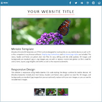
Configured Specifically For Mobile. For users that require the highest mobile compatibility for their website setup, see mobile optimized web templates. Developed with smartphones in mind, designs are single column and use icon and three bar menus for small viewing screens.
Smartphone targeted websites use standard HTML pages just like any other website but are usually single column with smaller images to allow for fast page load times. To build a website, the HTML pages and CSS style files need to be edited using either an HTML or plain text editing software package. When creating sites for mobile devices, you will want to keep image and file sizes in mind. Images used should generally be smaller than you might normally use for other media projects. See more on file sizes later in this document.
SEO (search engine optimization) is done during webpage editing and involves editing page meta tags and image alt tags. See more details below.
Our searchable support center covers all topics for creating a website including: webpage editing, editing images, meta tag editing, FTP uploading, SEO and search engine submission, plus many other topics you'll need when creating your new mobile optimized website project.
If you want to build a site that is highly mobile compliant then you will want to avoid including Flash, drop menus, video on the homepage and a large number of scripts. Although mobile networks are getting faster each year, large byte count website features are generally not considered mobile friendly.
Here is a list of some built-in features we offer:
- Mobile compliant drop menus
- Image galleries and slideshows
- Contact and quote forms
- HTML5 video players
- Mp3 music
- Paypal shopping cart
- Dynamic jQuery animation
Website Animation
When you create a mobile website, the best option for animation is jQuery or Javascript. We offer many templates that include jQuery instead of Flash as well as many jQuery-free and Flash-free website templates.All our animation applications and dynamic content use plain text files and standard .jpg images. Designs that include Flash are also created with detection to display alternate content in non-Flash (mobile) browsers. A "no animation" option is included in all designs to easily turn off all animation and show only static images and text for the highest mobile compatibility. No extra software is required to edit any animation. All files used are "linked" standard .jpg images and plain text files, with the option to use your own graphic logo creation.
Search engine optimization and submission are just as important when you create a smartphone targeted website and will be setup the same was as they are for any normal website. The steps are: Other options are to include an XML site map to make sure all your pages are listed at Google and other search engines, and using a "robots.txt" to tell search engines where your site map page is and other server side controls.
Free submission to all popular search engines is included with all our hosting packages.
With so many devices now available as well as regular updates, checking your site on all devices can be a daunting task, however, the main concerns should be that all your pages are error free, and that you site displays properly on as many devices as you can check them on. To test for smartphone and mobile compliance, see checking your website responsiveness in support.
Popular devices to consider are: iPhone, iPad, Samsung Galaxy and Google Pixel.
Building For Cross-Device Compatibility
Choosing how your site should work requires careful consideration. Whether you choose responsive or "responsive mobile targeted" depends very much on your business type and amount of information you need on your website. Choices include responsive design, using a second site for mobile, or using a full mobile website. To view the pros and cons of each see Choosing Responsive or a Mobile Version. In any case, the webpages should have a low total byte count on each page (small size and few images) and should "flex" in width from about 320 pixels to 750 or more pixels. See responsive templates to view all mobile compliant web templates.
Making the Design Flexible
Because of the vast number of devices available in all different sizes and screen resolutions, the best solution when creating a website is to concentrate on including a flexible or "responsive" width. Page widths more than heights are important for optimal viewability. CSS code should be included for both a maximum and a minimum page width so your site can flex or respond to fit on each device (See W3Schools). Smartphone page width goes down to 320 pixels and iPad is 768 pixels, however every device browser is different and smartphones as well as tablets should also be considered. With zooming available on most devices a good general rule is to set a CSS Media Queries min-width of 320 pixels and a max-width of up to 2000 pixels.
For smartphone optimized designs, a vertical view webpage width of 320 pixels with a 480 horizontal view width are the standard sizes. As devices are continually evolving, these widths may no longer be a hard and fast rule.
Updating Older Websites
Perhaps you setup your website many years ago. Technology has changed drastically with mobile and tablet viewing now being of more importance, particularly for SEO. You do have some options if you plan to update.
- View all update options.
- One option is to make your site adaptive. See Guide for Adding a Mobile Version.
- Use a Mobile Website Plugin (Creates an adaptive design).
- Order a Custom Built Mobile Version Website.
- Add Media Queries css and other responsive HTML code to your current website to update for mobile compliance. See Updating Older Websites For Mobile.
- The best option however is to re-build your current website using a new responsive design.
Whichever option you choose, you should carefully consider your options. If you update an older website by adding Media Queries CSS code it can be an involved task requiring learning how this type of css code works and may be easier to simply use a new template. If you go with a mobile version sub-site you will need to maintain two websites. If you choose to do a full update, you may want to consider using a sub-site first. This can allow you to ease into responsive design by adding a mobile complaint area without disturbing your current website. Once you have the sub-site completed you can optionally move this site into your top level hosting folder and make it your new website. See Choosing Responsive or a Mobile Version for a comparison of these options.
Smartphone Targeted Web Templates
File Sizes and Load Speed For Mobile
One important consideration while creating a mobile website project is the size of the images and other files. Long ago, the average recommended page size was as low as 60kb. As Internet connection speeds continue to evolve, this number is constantly changing. Of course the faster your site loads the better and more files linked on each page as well as images all can slow down the loading speed of any website.
The average page size at the time of this writing is about 2 megs. This does not however mean you should create your site right at this number. In our designs we try to keep the page sizes around 300kb or less. We might suggest that you not go over 1 meg but try to have an average page size under 1/2 meg total including all images and linked CSS, javascript, video and other media files.
Image Sizes and Byte Sizes
With any mobile design another consideration is how large your images are in height and width as well as in byte count. For our mobile sites the largest image we might include may be around 150kb, however, we do have many mobile sites that are under 500kb for the entire homepage including all images, scripts and text. Mobile devices and ISPs increase in speed every year and offer more bandwidth so these numbers are only a general rule. Our recommendation for the highest mobile compatibility is to keep your homepage under 1 meg total with all images and files for quick loading speeds.
Another consideration is "tap target" size. This includes linked images and buttons. In general the "tap targets" should be a little larger than on traditional websites. Google indicates that buttons and icons should be no less than 48 x 48 pixels in size.
When saving your images, select medium to high quality depending on the type of image and placement on the page. Usually background images can be saved at a lower quality. You may need to do some experimenting while saving.
Animation and Dynamic Elements in Mobile Sites
Mobile device connection speeds can be slower than direct wired computers so the number of dynamic elements and animations used on any website should be limited for faster loading speeds. Animation applications types are Javascript, jQuery and CSS3. jQuery is a popular set of Javascript library commands that can be added to any website. jQuery works well in mobile environments. CSS3 animation is also mobile compliant and works well for simple animation and other dynamic effects.
With either animation, the total byte count (file size) may use two or more times the amount of bandwidth a static element uses. When making your site mobile friendly try to keep the number of animations limited to only one or two.
Video
HTML5 and YouTube video can be added to any website. It can be embedded directly on a page like at YouTube, and you can generate YouTube code and add it to your website or template. This can however cause slow loading speeds. If your site is using a video for instructional or product/service information, it may be better to instead link to another page or directly to a movie file like an Mp4 from your pages (Mp4 is the most compatible video file type used on the Internet). See video options in support.
Search for "video" at the top of this page or see the features list for templates that include video.
Mobile Device Specific Meta Tags
There are some meta tags that are read by most mobile devices to configure the width of your site and also to make sure that, if your site is frequently updated, the latest content will always display.
The following "viewport" meta tag will "squeeze" your webpages to the resolution width of the viewing device zooming the entire webpage as much as possible while still displaying all content. For more available options for this meta tag see mobile meta tags at the Apple Safari Developer Library.
<meta name="viewport" content="width=device-width, initial-scale=1.0, user-scalable=yes">
Because mobile devices clear the cache less often, the following meta tag tells the browser that cached content will expire after 20 minutes. This tag should only be used on websites that are frequently updated, however this tag is not read by many web browsers.
<meta http-equiv="cache-control" content="max-age=1200">
Media Queries for Changing Layouts
In the section above the "viewport" meta tag is outlined to allow a website to conform to mobile device screens. For most sites this is a good general way to be more mobile friendly but will only work if your site can shrink to under 320 pixels in width for smartphones.
You'll want to use css Media Queries on your webpages to specifically detect, and then alter your website layout for mobile devices. This is called responsive web design or "RWD". In some cases this may not be a feasible solution for novice and more casual webmasters or websites with a lot of information. The following list outlines some possible issues.
Disadvantages of Responsive Design
- If the site includes a lot of text, webpages may be too long and unreadable on mobile.
- Large tables of information will not display well on mobile.
- Updates generally take more care and testing.
- Responsive design uses twice as much css code to configure for all devices.
- Areas of the webpages configured for mobile will not be visible during editing so you will need to edit and/or test on multiple devices or computers.
"Web templates can optimize for smartphone users while still allowing for compatibility on all other computer types"
Detection scripts, multiple sites and complicated responsive code may be great for large corporations, but small business needs a better solution. Any person that is trying to startup or run a small business simply can not afford to spend twice as much time working on their website. In this case responsive web design is the best solution.
HTML5 Device Optimized Website Templates
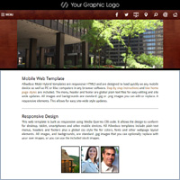
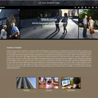
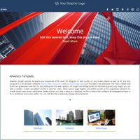
Built for simplicity, Allwebco HTML5 website templates are plain text webpages used in concert with plain text support files, for styles and scripts. Our sites are pre-built complete websites intended to allow professional web developers, as well as novice webmasters, to plug in their text content and images into the webpages to create a website. Allwebco tablet and mobile optimized templates are created with HTML5 code for the highest browser compatibility. See also what are website templates.
Mobile Optimized Designs
Understanding HTML
HTML webpage code allows plain text files to display as webpages in any browser software as a formatted site with text content, .jpg, .gif and .png images, scripts and jQuery, animation, contact forms, video, news feeds and other site elements. HTML is the most popular language code used by web browsers to dynamically format and then display website pages on the Internet.
The "HTML" stands for "HyperText Markup Language". It's basically a set of "tags" or "codes" used in plain text files to display typeface, images, hyperlinks, video and other elements you view in web site documents. The text, images, forms, video and objects are embedded into a website for an interactive user experience. The webpage you are viewing now is created with HTML code. HTML is not compiled like programs are, it's plain text that uses the scripts and applications already built into the web browser software.
All of our website templates are created using HTML code with CSS for styles and Javascript, jQuery and CSS3 for dynamic animation. Our mobile designs rate a 97 to 99 out of 100 at Pagespeed Insights for "user experience" and pass the Google Mobile Friendly Test. For more info on HTML and website building see HTML at Wikipedia or the W3C - World Wide Web Consortium.
Also see getting started at Allwebco web hosting.


