
What are Responsive Website Templates?
Responsive web design, or RWD, formats a webpage layout to be fluid for optimal viewing and navigation across a wide range of devices, including traditional PC and Mac desktop and laptop computers, tablet and surface, smartphones, and all other mobile devices. By detecting the device screen width using Media Queries css code, it allows for better cross-device viewing by shrinking or expanding image widths, changing font sizes, reducing margins and hiding non-mobile friendly elements.Traditionally websites and web templates were typically designed with fixed widths, set image sizes and a specific overall browser width. With the introduction of responsive design, web pages can be designed to respond or "flex" as the browser width narrows. This allows html webpages to shrink or expand to fit mobile and tablet screens.

To allow HTML webpages to adapt to the different device and computer screen sizes the most common widths used are 320, 480 and 768, 1024 pixels for smartphone portrait, smartphone landscape and tablet portrait and landscape views respectively. Rather than create a website at 320 pixels wide as the smallest common denominator, css "Media Queries" are built into the designs to allow a website to change layout, image sizes and other design elements for optimal viewing across all devices including desktop, laptop, tablet and mobile.
Benefits of Responsive Design
There are a lot of advantages to building a website using this style of code. First and foremost, a responsive website, flexing for individual display screens, will look better and function better across all computer types and devices. Font and image sizes will be more cross-device viewable and links and buttons will be more clickable.You can make your website mobile compliant in one of two ways. You can create a second set of webpages specifically tailored for mobile device viewing, using either an automatic smartphone redirection script or passive css redirect, or you can use responsive design and will then only need to maintain a single set of webpages. Additionally, it's important to build your webpages so they pass the Google mobile friendly test for better search rankings.
Media Queries CSS
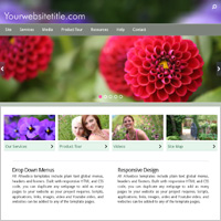
Css code is used in websites and web templates to define styles like font sizes, webpage colors, layout widths and heights. "Media Queries" is css code that targets specific device browser settings like screen size, device-orientation and other device elements. Using this tool you can, for example, setup a website to display a larger font on 320 pixel wide mobile screens. In addition you can hide elements, move elements, make images stretch and narrow to fill the device screen and more. This powerful "responsive" code can automatically re-design a website or web template layout as the screen display changes. See: Media Queries support.Responsive Design Features
- Website layout changes as the display resolution changes
- Stretches images to fill the browser window
- Can detect multiple screen resolutions
- Plain text css code for easy tweaking
- Creates a website that adapts to different devices
- Only a single set of webpages is required for all computer types
- Changes fonts, widths, heights or hides elements on small screens
- Can create responsive video that changes size as the screen narrows
mobi-hybrid® Web Templates
To view some responsive for mobile website designs check out our mobile friendly web templates. These designs are mobile compliant and built in HTML5 and CSS3 to W3C specifications. They respond for all devices: desktop, laptop, tablet and smartphones and are stand alone downloadable web templates.Regularly updated as the Internet evolves, our webpage templates are error free HTML W3C compliant designs. Used by both professional developers as well as novice webmasters, all website downloads include step by step instructions and comprehensive support. See some live sites in use on our user list page.
Importance of Flexibility For Mobile
Page widths, more than heights, are important for screen viewability. Because of the large number of devices, and different browser software available, any website needs to be flexible enough to be cross-device viewable. Desktop and laptop computers, tablets, mini-tablets, smartphones and other devices all need to be considered when designing a website. Screen resolution is a major factor and responsive design using Media Queries allows a site to conform to a vast array of devices. CSS styles should be included for both a maximum and a minimum page width so a site can flex and respond to fit the browser. Every device browser has different proprietary rendering aspects so any new website should be fully tested.For a mobile only design, web page width should be kept under 320 pixels. For landscape view this will be 480 pixels and on tablet the portrait screen width is generally 768 pixels with 1024 for landscape view.
File Byte Sizes & Load Speed
Although Internet connections get faster each year, it is important to consider the file sizes of website images, video, widgets and other applications to allow for fast page loading. Save your images at a lower quality and if your software includes the option to save for web use you should use that option. You may want to do some experimenting with your "save as" options.A general recommendation for mobile page loading speed is to keep your home page under about 500kb total including all images and files and applications. Video and other large footprint animation should be used on your website sub-pages. A fast loading website is the goal, and the more files, linked CSS, widgets, Javascript, and images on a webpage the slower it will load. Additionally, some search engines do rank faster loading websites higher.

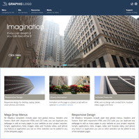


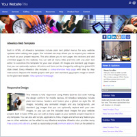
Mega Menu For Business
Animation and Dynamic Elements on Mobile
Mobile connection speed is generally slower than a direct Internet connection, so the number of animated or "dynamic elements" and widgets on a webpage should be kept limited for faster loading speed. jQuery, Flash and Javascript are some of the elements you will want to include on a webpage, however, you should limit yourself to adding only one or two of these elements to a single webpage. These applications can use up considerable bandwidth and browser resources.All Allwebco templates include some Javascript. Many designs include jQuery animation, and if Flash animation is included it will have detection to show static alternate content on non-Flash devices. You can search for jQuery or Flash at the top of this page to view website templates that include these applications.
Video on Mobile Devices
HTML5 video and also YouTube embed code can be added to any type of website or template. YouTube embed code can be generated in your account and the code is pasted directly into the webpage. See YouTube help. Any type of video can cause a page to load slowly so add only a single video to a page and consider that if you add a video to your home page, be sure to test it on a few different mobile devices. If your website uses video for instructional or product information, you may want to consider linking to a sub-page with the embedded video. See also video support.Youtube video embed code is not setup as responsive. Css code must be added in the HTML webpages to make the video "flex" to the viewer's device screen width. See the features list or you can search for video at the top of this page to see some web template options.
Meta Tags for Mobile Devices
The "meta viewport" is a tag that is used in HTML pages to indicate to mobile devices how to respond to the webpage. In most cases this tag should only be included in responsive websites that can respond to be as narrow as a 320 pixel width webpage or in mobile designed sites. See also Content Adaptation at W3C.org.The following "viewport" meta tag works globally for most mobile devices. This tag goes in the head section of your HTML pages. Use this meta tag only in HTML webpages that flex down to 320 pixels or less in width, do not use this code on a fixed width website.
<meta name="viewport" content="width=device-width, initial-scale=1.0, user-scalable=yes">
To save load speed time, most mobile devices do not clear the cache each time they exit a website. The following meta tag tells the browser to expire the website after 20 minutes. Use this tag on HTML webpages that are frequently updated.
<meta http-equiv="cache-control" content="max-age=1200">
Mobile Site Building Tips
If you're designing a responsive website, things to keep in mind are:- Include a viewport meta tag
- Use CSS Media Queries for responsiveness
- Webpages should flex down to 320 pixels in width
- Create menus that collapse or shrink to fit the screen
- Keep your image sizes small, use less images per page
- Place fewer applications like video and widgets on the homepage
- Carefully monitor your homepage total byte size (this can affect SEO)
- For images wider than 300 to 320 pixels, use a 100% width instead and setup code so they stretch to a css max-width and min-width
- Test your webpages using Google Pagespeed Insights and the mobile friendly test
- Download some free responsive intro pages that include simple Media Queries code you can edit and experiment with
Remember that with responsive web design you'll want to create HTML webpages that can flex down to at least 320 pixels in width for smartphones, and then respond up in width for desktop and tablet computers to anywhere from 740 to 1500 pixels or greater. You can search at Google for all of the above indicated items. You will find many sites with information to help you setup your website and keep it mobile friendly.


Downloadable templates
Stand alone websites
Step by step instructions
Standard .jpg images
Graphic or text logo
Global CSS styles
Plain text editable menus
Use any text or HTML editor
Order with or without hosting
No monthly fees
Browse Websites
Support
Offering the most comprehensive web template searchable support on the Internet. Our support covers all aspects of website setup.Live Client Sites
Since 2004 Allwebco Design has been providing HTML website layouts to both professional developers as well as novice and first time webmasters. View some user samples.Other Resources
Getting StartedMobile Friendly Tips
Google Mobile Guide
Lifewire.com RWD Definition
Lifewire.com RWD Introduction
Wikipedia Responsive Design
Writing Webpages for Mobile
Responsive Design and SEO
About Templates
HTML
HTML5
What Are Web Templates?
What are Bootstrap Website Templates?
Site Building
Site Setup Help
How to Build a Website
Create a Mobile Website
Creating a Realtor Website
Build a Musician's Website
Create a Shopping Cart Site
Set Up an AdSense Website
Setup a Photography Website
Developing a Business Website
Building HTML
Mobile
Mobile Optimized
Update For Mobile
Adding a Mobile Version
Mobile Detection
Mobile Site Usability
Mobile Sub-Sites
Mobile Version Sites
Mobile Overlay Detection
Responsive Web Design
Developer
Developer Quality
Stand Alone Design
Downloadable HTML
Site Builder Alternatives
General
Site Map
Product Tour
Design
Responsive
Shopping Carts
Photography
Drop Menus
VS
Responsive vs Sub-Site
Builder or Templates
Browse Websites


