Mobile Detection / Redirection
Mobile redirection scripts allow for HTML websites to have one set of webpages for desktop, laptop and tablet computers, and one set for smartphones. This can be done using either jQuery and Javascript, or an overlay using css Media Queries that allows smartphone users to select which version of the website to visit. You will usually place the mobile version website inside a folder on your website, or optionally, you can redirect to a separate domain configured to target smartphone users.When to Use Detection
Perhaps you have an older desktop website and rather than update this to responsive web design (RWD) and rebuild the entire website, you can add a second mobile targeted version website. Or maybe your website is image and script heavy and you need a way to allow smartphones to load faster and offer only the most relevant information to mobile users. This can be done using responsive websites with css code, or optionally a mobile version with leaner webpages setup for better small screen viewing. Optionally, both websites can be responsive.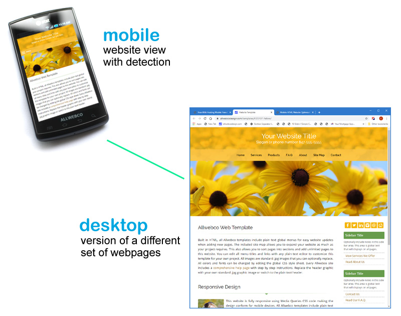
Smartphone Target Options
To add a smartphone targeted version, you'll need a responsive website setup inside a folder on your website, or on another domain. The redirection script or css code is added to your main desktop website inside the top level hosting folder, usually named "public_html" or "www". Once a desktop page is loaded by a user, the detection will allow for the redirection code to activate. The following lists options to update.Targeting Smartphones
- Mobile addon templates
- Smartphone redirection scripts
- How to add a mobile version website
- Mobile optimized web templates
- All responsive web templates
Types of Detection
You can use jQuery Javascript. jQuery is actually a library of Javascript functions. Or you can use css Media queries to have an overlay popup to allow users to select which website to visit.Automatic jQuery / Javascript
This option uses the jQuery library and a script to automatically redirect smartphone users to the mobile only version. Users will not be able to select which website to visit and all smartphones will automatically land on the mobile version website. View scripts.
CSS Overlay
This option pops up a small overlay once the screen resolution is detected using css Media Queries. The overlay shows links to allow the user to select which website to visit. The overlay is configurable as far as colors and styles using standard css code. View scripts.
The Mobile Version
To specifically target smartphone users, you'll want to setup this version of your website to load faster and allow for optimal rendering on small screen resolutions. However, you can actually use any responsive website template for this setup.Web Template Options
SEO and Redirection
If you are setting up a second website inside a folder to target smartphones, you'll want to link to this version from your main top level website using a plain text link. It's best to use HTML and XML site maps to list all pages on both website versions. This will allow Google and other search engines to see and list all your webpages. Once you complete your linking scheme, your mobile version will list better in mobile searches and your desktop version will do better on desktop computer searches. In any case, adding a mobile version will improve your mobile SEO.Conclusion
Smartphone Internet users outnumber desktop computer users, so updating for mobile using either a responsive website or a desktop and second smartphone version will help get more users on your website. You'll need to decide, based on your business model, which type of website will best boost the visibility of your product or service.


About
HTML Web Templates
HTML5 Web Templates
What Are Web Templates?
Stand Alone Design
Site Building
Site Setup Help
How to Build a Website
Create a Mobile Website
Creating a Realtor Website
Build a Musician's Website
Create a Shopping Cart Site
Set Up an AdSense Website
Setup a Photography Website
Developing a Business Website
Building HTML
Web Templates
Mobile Optimized
Tablet Optimized
Photography
Single Page
Minisites
Budget
Music
This or That
Responsive vs Sub-Site
Builder or Templates
Browse Websites
