Mobile Compliance & Responsive Web Design
There are a few different options to allow for website mobile, smartphone, tablet and desktop/laptop compatibility. Details for each of these options is outlined in the sections below.Mobile Usability Options:
- Responsive: Uses CSS Media Queries styles to automatically re-configure your website layout when viewed on a mobile device.
- Automatic Adaptive: Maintain two sets of webpages, one for mobile, with detection to automatically detect for smartphones and redirect the user to a different set of webpages.
- Adaptive: Maintain two sets of webpages including links on your entrance page to allow users to select mobile or desktop viewing.
- Mobile Targeted: Use a design that specifically targets smartphone and mobile device users.
Responsive Design
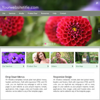
The most common style of mobile compliance and targeting. Responsive designs use css Media Queries to detect the viewing device screen resolution and automatically alter the layout to fit the screen. Webpage elements will resize or may be hidden on smaller screens to allow for the most relevant information to be displayed on smartphones.Advantages:
- Requires only a single set of webpages.
- Compatibility on all devices and computers.
- Users will not need to zoom your site on mobile.
- The trend toward larger smartphone screens means better future mobile display.
- Limited control of site appearance on mobile.
- Extra editing and extensive testing may be needed to get the look right on every screen resolution.
- Updates must be tested across multiple platforms.
- Mobile version may load slower.
- Webpage code may be bloated with extra css Media Queries.
See Responsive Web Templates
Read More About Responsive
Automatic Adaptive
Some large corporations and high end websites may be setup to maintain two or more sets of webpages. A desktop version with detection that automatically detects smartphones and mobile devices and then redirects the user to an alternate set of webpages designed for each specific screen resolution.Advantages:
- Better control of your website appearance across all platforms.
- Ability to include different content for mobile.
- Two or more websites must be maintained.
- Updates take considerably longer.
- Each update must be tested across multiple platforms.
- Redirect scripts can become out of date as new devices are developed and must be maintained.
See Adaptive Web Templates
Read About Mobile Redirection
Mobile Detection Scripts
Adaptive With Click Selection
In this case you will setup two or more websites as outlined above, however, your homepage will include text or image links that allow users to select either the mobile or desktop version of your website. Optionally, a CSS overlay can be used, alone or in conjunction with an into page, to display on selected screen resolutions.Advantages:
- Total control of your website appearance across all platforms.
- Ability to include different content for mobile.
- Two or more websites must be maintained.
- Home page design will usually include less information to allow fast mobile device load times.
- Updates take considerably longer.
- Each update must be tested across multiple platforms.
See Adaptive Web Templates
Read About Mobile Detection
Mobile Detection Scripts
Mobile Targeted
If your business will attract a much larger percent of smartphone viewers than this may be the best choice. Image, animation and script byte count should be considered, as well as page width and font sizes and colors. Webpages will shrink down to 320 pixels in width, while still flexing up to no less than a 480 pixels screen resolutionAdvantages:
- Site is configured specifically for small screen devices.
- Only a single set of webpages needs to be maintained.
- Maintenance for your site will be less involved.
- Less files and scripts.
- Lower overall cost.
- Faster page loading.
- Webpages may not look as good on desktop & laptop computers.
- Limited use of scripts and website applications.
- Smaller images.
Tips For Mobile Targeted:
- Keep the total minimum page width under 750 pixels targeting down to 320 pixels.
- Keep the number of images and scripts low, and small in byte count.
- Test all sites on mobile and tablet for compatibility.
- Videos should not be included on the homepage.
- See also Mobile Compatibility in support.
See Mobile Optimized Web Templates
See Tablet Optimized Web Templates
Read More About Responsive
About Allwebco Web Templates
Built as stand alone downloadable designs, Allwebco offers a large selection of "complete" website templates built specifically to allow for the highest mobile compatibility and balance on PC and Mac, tablet, smartphones and other mobile devices. Our designs include multiple pages, drop menus, contact forms, image galleries, video pages, PDF download pages and more all built right into the designs. See template features for more details.
We are constantly updating our websites as well as developing new designs to keep pace with current PC and Mac as well as mobile technology. All designs are W3C complaint web standards HTML and CSS to allow our clients to enjoy the most current "best practices" web standards for any website project.


About Templates
HTML Web Templates
HTML5 Web Templates
What Are Web Templates?
Site Building
Site Setup Help
How to Build a Website
Create a Mobile Website
Creating a Realtor Website
Build a Musician's Website
Create a Shopping Cart Site
Set Up an AdSense Website
Setup a Photography Website
Developing a Business Website
Building HTML
Mobile
Mobile Optimized
Update For Mobile
Adding a Mobile Version
Mobile Detection
Mobile Site Usability
Mobile Sub-Sites
Mobile Version Sites
Mobile Overlay Detection
Responsive Web Design
General
F.A.Q.
Site Map
Product Tour
Web Developer Grade
Design
Photography
Design Layouts
Template Features
Stand Alone Design
Mega Menus
Drop Menu Styles
This or That
Responsive vs Sub-Site
Builder or Templates
Alternative to Site Builders
Browse Websites
