 |
Updating for Mobile Devices By Erich Vokral - January 10, 2017 If your website is not currently mobile friendly, and you are planning to update, the following are some options. These tools and helpful resources can help you decide how to get your pages up to date and allow for better mobile & tablet display, as well as improving your SEO and search ranking. The following solutions will work whether your current site is older code like HTML 4.01, or is a static design that does not flex on mobile devices to fit the screen resolution. |
Option #1: Update Your Current WebpagesYou can edit your current webpages and css files to make them more mobile friendly by adding Media Queries css code so they respond to different device viewscreens. Although the buzz word (or trending if you prefer) right now is RWD (responsive web design), updating a static or non-responsive site to be responsive can be a huge undertaking and is only recommended for users that have a lot of experience editing the html and css files. In most cases there will be quite a lot of new things to learn, and the update process may take a considerable amount of time.Key Points
|
 |
Option #2: Add a Separate Mobile AreaYou can add a 2nd website on your current site just for mobile viewers. With this option the mobile version, or sub-site, can be located in its own folder or optionally using a different domain. Search engines, like Google, will see your mobile site inside the folder and list them higher for smartphone searches. The site being located in a folder will have no adverse affect on ranking. You can optionally add an auto redirection script.Key Points
|
 |
Option #3: Build a New Responsive WebsiteYour time may be better spent moving your old site content into a new web template design. Responsive designs are best for smaller websites, although they can work for larger sites as well. SEO and mobile friendly, webpages in this style of site will flex the body of text and images to fit all device screens, desktop, tablet as well as smartphones. Css Media Queries code in the design detects the viewscreen resolution to allow the responsiveness.Key Points
|
 |
Option #4: Build a New Website With a Sub-SiteA fresh new design may be the best option for updating an old website. Building a new site with a separate mobile version allows you to more specifically target mobile users. Although more webpages must be maintained, the code in each page is more simplified than in a responsive design. As a general rule this type of website setup will allow for more comprehensive SEO, better page ranking and a better user experience due to faster page load speeds as well as having a more condensed version of your top level or "full" website just for mobile.Key Points
|
 |
What is Responsive Design?
Responsive design is a way to build or "code" website pages that allows them to "flex" or conform to all devices including desktop, tablet and smartphones using Media Queries css code. When viewed on a desktop, laptop or tablet computer the website will expand to fill the entire width of the view screen. On smartphones and other small mobile devices the webpages will shrink in width to fit the screen resolution. This will generally make for some very long webpages on mobile devices, so in many cases elements, or areas of text can be hidden so a more condensed version of the webpages displays. Additionally, images are setup to shrink in size and other non mobile friendly elements may be hidden to allow for faster page loading speeds and a better viewer experience.
What are Media Queries?
All current websites use css code for fonts, colors and other webpage styles. Media Queries css code detects the screen resolution of the device a webpage is being viewed on. It then allows the styles of the webpage to dynamically change to allow for better rendering in the viewing device. It can alter font sizes, image sizes, layout elements and can also be used to hide elements that may not work on smartphones but are desired for desktop website viewing.
Media Queries can be used in older websites and can detect not only screen resolution, but it can be used for device-orientation, print, projection, and more. With this tool you can setup your webpages to display one font size for desktop and one for smartphones by setting a screen resolution "breakpoint" of 320 or 480 pixels. Images can stretch to fill the full browser width, elements can be moved to different locations or hidden and you can even have smartphones display different colors for fonts and backgrounds. See what are responsive templates for more details.
Making Images Flex
To allow a website to be viewed without side scrolling on multiple devices, large images should be made flexible so they can dynamically expand and shrink to different screen resolutions on all devices, smartphones, tablet and desktop. This is done using css code to define images at a 100% width. Optionally, images can also be made to shrink and expand at fixed intervals using Media Queries. See image help in support.
Other Updates for Mobile Friendliness
In addition to having a website dynamically change fonts, layout and image sizes using Media Queries css, you should consider having less images on each webpage, smaller images, and also hiding any elements that are not mobile friendly. Page load speed is a factor not only to allow for a better user experience, but for better search engine ranking. Again these modifications can all be done using Media Queries code.
Tap Targets: Tap targets are linked icons, menu buttons, form submit buttons and any small webpage element that links to another page or website. For the best SEO you should try to get these elements sized large enough to pass the Google Pagespeed Insights Test. This is a useful on-line website checker tool offered by Google. It shows problems on your website that you should fix so your site can pass the Google Mobile Friendly Test and rank better in mobile searches. Although you do want your site to be mobile compliant, if your site does not pass this test you may still rank well for desktop searches.
Mobile Meta Tags: Once you have your webpages setup as responsive, you can add a "viewport" meta tag that allows your webpages to fit precisely into different viewing screens. This meta tag should not be added unless your html pages can respond down to under 320 pixels in width. 320 being the smallest smartphone resolution. Check updating your website for mobile in support for more details.
How Difficult is Responsive Design?
Hard, really hard, tremendously hard, unbelievably hard. Yes, this section is written to scare away only the most stout of heart. You may have checked some other websites espousing the benefits of RWD (responsive web design), however in most cases these articles are written by experts in the field and professional developers. For more casual webmasters, converting a static or fixed width website to RWD will use twice to three times the amount of code, and four times the amount of time (usually more). If you are unfamiliar with this type of code there will be quite a number of new things to learn.
Another time consuming aspect or RWD is the testing. Although there are on-line website checkers, in reality these checkers are not always a true indication of how the webpages will behave once Media Queries and other RWD code is added. You will need to rigorously test all your webpages on the actual computer and mobile devices, and then... test again in the on-line checkers.
Mobile compliance requires faster webpage loading. You will be more limited in the number and size of images, amount of text, and what dynamic elements can be included in the webpages. If you have an older static website and responsive design is the direction you really want to go, then either building from scratch or updating with a new design will, in most cases, be a more time effective way to upgrade.
We've Done the Work For You!
Our responsive and mobile webpage templates are fully tested for mobile compliance, pass all Google friendly and speed tests, and use simplified code (with notes) to allow you to better understand and build on the included css code. Step by step instructions and support are included. See Responsive For Mobile Web Templates.
Separate Mobile Version Option
Including a 2nd website that is a mobile version of your full website allows for better individual targeting of desktop, tablet and smartphones. You can include a more condensed version, smaller images, and quicker loading applications on the mobile webpages while still maintaining a high end website for desktop viewing. With larger and more complicated websites this allows for easier editing of the website files and pages. To help decide what the best solution for your project is see responsive vs mobile.
Easing Into Mobile
Many webmasters are a little overwhelmed by the options as well as a perception of how much time will be spent to update. Although your website is a concern, and you want it to do well, you have to look at your priorities. Do you want to concentrate on your product or service and your website is more of a secondary priority? How much time do you want to spend updating webpages?
Recommendation: For our clients we have been recommending that rather than do a full blown website update, another option is to add a mobile sub-site using a responsive design. This allows for quick mobile compliance, while the mobile site is being expanded. You can start with adding all your most important information first. If you choose a responsive design that looks good on desktop for your mobile version, you can always make the sub-site your primary site at some future date once it is completed.
Mobile Solutions
- Step by step add a mobile version tutorial
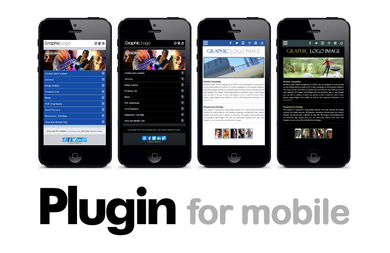
- DIY mobile sub-site plugin
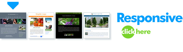
- Responsive web templates (All designs work as sub-sites)
- Responsive Minisites (Good sub-site choice)
- Custom built mobile sub-site
Moving Into a New Web Template
In cases where a website is just to old or has too much bloaty code, rather than try to fix all the webpages it can be much faster to just "port" the page text copy and images into a new website template. You can select the text right in a web browser, copy it and paste it into the new webpages to prevent the old code from being copied. Editing this way keeps the code clean, however, you do need to reset the links and any font formatting. When I update to a new template I will use separate folders for the new and old websites. Once you get into a rhythm, updating can go pretty quickly.
New Site Options
- See responsive or mobile to understand your site options.
- Responsive web templates
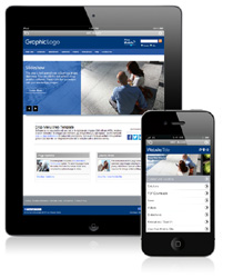
- Desktop websites that include a mobile version
More Details if Updating With a New Website
With older websites, using a new web template can be a more time effective way to update. Most time on a website is spent writing the page copy and creating images. If you use one of our web templates you can copy the text from your old website and use some of the old site images. All our designs include step by step instructions and you can select one of our responsive designs or a webpage template that includes a mobile version website (See Responsive or Mobile Chart). Moving site content from an old website into a template generally takes about 1/2 to 1 hour per page.
About Our Web Templates
Allwebco Design offers self contained stand alone downloadable zip file websites. All templates are ad-free and are not linked to our website other than a text copyright footer that can be edited or removed. Our designs are setup with multiple pre-formatted webpages used for common tasks. Pages may include: home, about, services, links, FAQ, privacy policy, PDF links, dynamic image galleries and slideshows, shopping carts, video and more. Any template is returnable within 30 days and we include a free extended download service. When we update any template you can request a new free download for any past purchase. See Web Template Features.