
Mobile Optimized Web Templates
Mobile Optimized, Self-Contained Zip DownloadOptimized for smartphones, the following website templates are setup for mobile viewing, however are also fully responsive for tablet and desktop. Menus are icon and three bar based, designs are single column W3C compliant HTML/CSS.


mobi-Hybrid®
2025 Updated / 14 pages Responsive / Features: Single column design, 3 slideshows with index, social icons, payments/donation page. Excellent for novice webmasters. Best suited for targeting mobile viewers. Works with any web hosting company.


mobi-Hybrid® Business
2025 Updated / 14 pages Responsive / Features: Single column design, 3 slideshows with index, PDF page, news page, social icons, payments/donation page. Excellent for novice webmasters. Best suited for targeting mobile viewers. Works with any web hosting company.


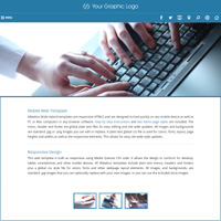
Budget Responsive
2025 Updated / 8 pages Responsive / Features: Contact form, detailed services page, single column design, excellent for novice webmasters. Works with any web hosting company.


Merchant
2025 Updated / 11 pages Responsive / Features: Contact form, dynamic FAQ, social icons, right sidebar. Excellent for novice webmasters. Works with any web hosting company.


Minisites
2024 Updated / Responsive / Available with different features including model versions: Basic, business, merchant, slideshow, gallery, and video. Minisites are best suited for website projects that target mobile viewers. Works with any web hosting company.


Single Page
2024 Updated / Responsive / All needed elements on a single page, one page web templates include an animated jQuery slideshow, contact info and social icons. No-animation version included in download. Works with any web hosting company.


Mobile Add-On
2022 Updated / Responsive / 10-13 pages Responsive / Features: Single column design, social icons setup. These web templates can be added to any existing non-mobile compliant website to add a mobile version inside a sub-folder. Works with any web hosting company on any website.What is Responsive Design?
Responsive web design (RWD) allows webpages to flex and fit any size viewing screen resolution. Using media queries css code, the page layout will change and flex as the screen increases or decreases in size to allow for optimal viewing on desktop, tablet, smartphones and all mobile devices. Read more about responsive design...Details
Allwebco templates are download as a zip file folder and are complete stand alone bootstrap website templates. W3C compliant HTML and CSS, all colors and fonts are editable in the global .css style file. Download includes all stock photos and source files used for the build. Animation uses standard jQuery Javascript and 3rd party scripts, widgets and applications can be added to any of the webpages. Can be edited using any standard wysiwyg HTML, or plain text editing software, Notepad on Windows, Textedit on Mac. Compatible on both Mac and PC. See features for more details.Compliant for all mobile device and computer types, designs include multiple pre-formatted pages, replaceable standard .jpg and .png images, plain text global menu, header and css style files. For both business or personal use.
Setup & Support
Offering the best support in the industry, downloads include step by step instructions, comprehensive support, a searchable support center and a 30 day money back guarantee with a 90 day trade-in allowance. Additionally, you can request a free new download at any time.Compatibility & SEO
Compliant with all web browsers on all device types, smartphone, tablets, laptop and desktop Mac and PC. Stand alone designs are download and contain no linked files so will work as designed both on and off line. Designs are built using standard HTML and CSS, standard .jpg images and jQuery Javascript for animation and dynamic applications. Works with any hosting company on any server type.Allwebco templates are SEO friendly using W3C web standards HTML, CSS and META and headings tags to allow you to optimize your site for comprehensive search engine listings.